Use this link to view sales stats from each month in 2010 and 2011. Your comparison could be between Xbox hardware sales and Wii hardware sales.
http://vgsales.wikia.com/wiki/NPD_sales_figures
You will need to click on each month and write the sales amount in a table. Then plot the data on a scatterplot graph.
St. Peter

Our Patron Saint!
Monday, January 30, 2012
Tuesday, January 24, 2012
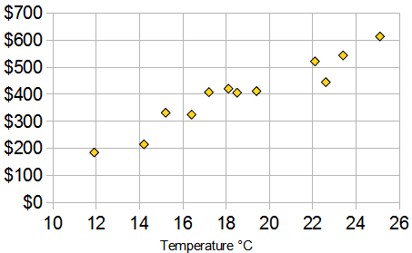
January 24, 2012 - Analyze the Data - Is there a relationship between temperature and ice cream sales?
| Ice Cream Sales vs Temperature | |
| Temperature °C | Ice Cream Sales |
|---|---|
| 14.2° | $215 |
| 16.4° | $325 |
| 11.9° | $185 |
| 15.2° | $332 |
| 18.5° | $406 |
| 22.1° | $522 |
| 19.4° | $412 |
| 25.1° | $614 |
| 23.4° | $544 |
| 18.1° | $421 |
| 22.6° | $445 |
| 17.2° | $408 |
And here is the same data as a Scatter Plot:
Line of Best Fit
You can also draw a "Line of Best Fit" (also called a "Trend Line") on your scatter plot: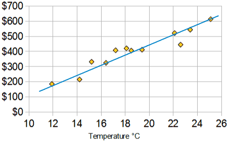
Thursday, January 12, 2012
Random Math Thoughts
Use this section to document any interesting math thoughts that you might have!
Subscribe to:
Comments (Atom)